Food Collab App
Food Collab is an application prototype created for my thesis project in the Masters iMedia program at Elon. The app is a solution to mitigate food insecurity and waste by providing a platform for convenient food-sharing. The app would allow soup kitchens and food pantries in Alamance County to easily connect with local business donors and vetted volunteers to enable easy access to more available resources and create less food waste.
Scroll through the process details to get to the prototype and a detailed explanation.
THE PROCESS
STEP 1: RESEARCH & PERSONA DEVELOPMENT
Online research and interviewing members of the community helped to identify issues with food insecurity and food waste in Alamance County. Understanding more about the local issues and American food safety laws, the scope of this project was refined to focus on local nonprofit agencies who provide for their communities via food pantries and soup kitchens, the local businesses who donate food to them, and the volunteers who make it possible.
Using the main pain points and goals gathered from research, an agency persona and a donor persona were developed. Creating these personas highlighted the most relevant user details from the research and were used to inform the development of the user flows.
STEP 2: MAPPING THE USER FLOWS
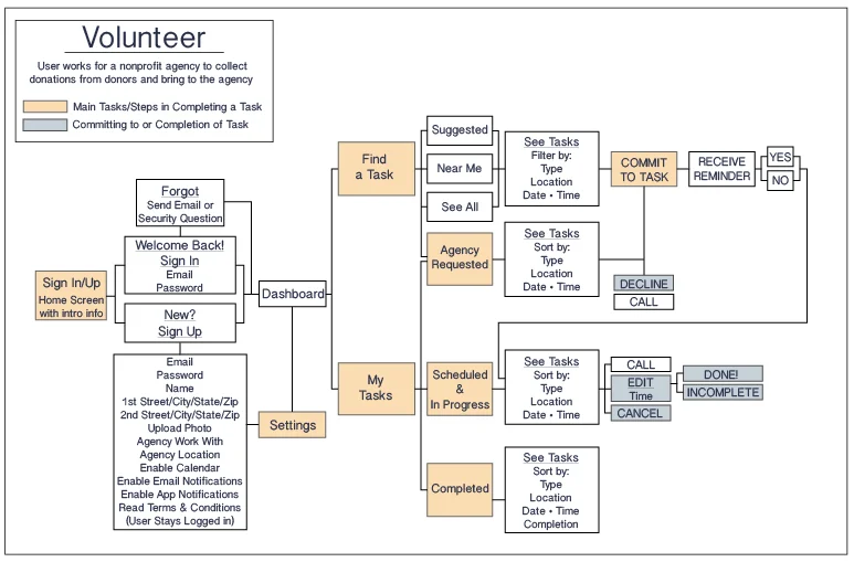
Mapping the user flows for all three users, and revising each three times, was an integral step in creating this app. Creating the user flows helped develop the simplest paths for each user to achieve the necessary goals. Key features, with necessary function, were also identified during this process.
Challenges: The most difficult aspect of this step was simplification by removing features/functions once thought to be integral - such as a direct messaging capability. It was also challenging to create flows for three different users that maintained an overall unified flow pattern but was tailored to meet the different needs of each user.
STEP 3: WIREFRAMING + MOODBOARD = MOCKUPS
Wireframing is more than creating the lines to color the mockup in between. It's about using the base IA, or user flow in this case, to visually map general features and information to create the basic mechanics of the UX. Sometimes after the first iteration of wireframes to mockups, you realize the UX should be completely different based on what the UI has become. That is what happened in this case.
Throughout the building process the main user goals remained the same - except for one. The goal to allow an agency to "claim a need," creating a bank of searchable "available needs," was removed. At the beginning it seemed like a "neat" additional perk of the app, although nonprofits don't function that way in the real world. During the leap from wireframes to mockups, the lack of pertinence and the complications it provided led to eliminating it.
The numbers on the wireframe/mockup screens indicate which screens have similar functionality - and how they changed. The connectors show navigational flow. From three columns in the wireframes to two in the mockups, it is easy to see that by sectioning the dashboard with tabs (and eliminating several back buttons) and adding the sticky bottom nav bar greatly simplified the user experience.
Challenges: Organization: complicated dashboards, and navigational features like the back button vs sticky nav bar were challenging in this step. From the wireframes to the mockups MAJOR changes were made in not only functionality but navigation and organization that simplified the app and made great differences in the overall user experience.
Tools in STEPS 1-3: Illustrator
STEP 4: USER TESTING & PROTOTYPING
User testing of the Volunteer user type was conducted using paper cut-outs of the screens. Testing was done prior to prototyping the 115 phone screens into InVision incase any major discoveries were made. Five users were give four scenarios and tasks and there were twelve identified issues and about as many targeted fixes in the refinement plan.
Challenges: New to an app like this the users found that there was a lot of contextual information on the screens - locations, dates, etc - to get bogged down with. Most thought that this would not have been an issue once familiar with the app, and it was noted that an initial tutorial or walk-through would have helped greatly.
Tools: InVision
THE PROTOTYPE
USER INTERFACE FEATURES OF THE APP
The following feature descriptions were created to help explain main functionality of the Food Collab App for each of the three user types. Heaviest on reading, this documentation is possibly the quickest way to understand the main functionality of the Food Collab app.
VIDEO OF THE USER EXPERIENCE
Prototypes can be confusing and lead to aimless clicking without understanding. A video of a choreographed use, or a user flow in motion, can be helpful in explaining and showing how the app prototype can be used to obtain specific goals. This video is a brief demo of the Food Collab app prototype showing some of the functionality of a volunteer's user experience.
The final deliverable of this project was a prototype of the app created using InVision. This prototype is no longer available.


